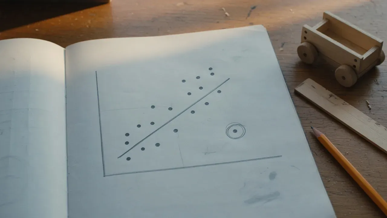
When a graph is not an answer.
A graph can be neat, colorful, and still not answer the question. Students need to learn what the graph means.
Students often learn how to make a graph before they learn how to argue from one. The points are plotted, the line is drawn, and the assignment feels finished. But a graph is not automatically an answer. It is a way to display evidence so the next question can be asked more honestly.
Bright Minds already points students toward that habit through the scientific reasoning materials. The Health & Nutrition reasoning page says, “Real science is a loop, not a line.” That same idea applies to graphs: the picture is part of the loop, not the end of it.
A graph should make a student more careful, not more confident than the evidence allows.
Variables come before axes
Before a student labels an axis, they need to know what changed, what was measured, and what was supposed to stay the same. The independent variable is the thing deliberately changed. The dependent variable is the thing measured. Controls and constants help the student ask whether the observed change is likely connected to the intended change.
NGSS treats science practices, the things scientists do as they investigate and build models, as part of science learning itself, not a decorative final step.1 That is why students should be asked to explain why a graph was chosen, not only whether it looks right.
Trends, outliers, and uncertainty
A trend is a pattern in the data. An outlier is a point that does not fit that pattern. Uncertainty is the honest space around a measurement or interpretation. A strong lab conversation asks about all three.
In physics, a cart or motion example can help students connect slope with change over time. In chemistry, repeated measurements can show why a single tidy value may not be enough.
Correlation is not cause
If two things rise together, the graph may show an association. It does not automatically show that one caused the other. A student needs to ask what else might have changed, whether the test had a control, whether the sample was large enough, and what result would weaken the claim.
That last question is powerful: what would change your mind? It turns a graph from a decoration into a test of reasoning.
Examples across courses
- Physics: a cart or motion dataset where slope has meaning.
- Chemistry: measurement data where units and repeated trials matter.
- Environmental science: counts or observations that show a trend but require caution.
- Forensic science: mock evidence data where a graph can suggest a pattern without proving guilt.
The best follow-up is often a live question: “Show me the variable you controlled.” “Which point worries you?” “What would you test next?” Those questions connect this post to Follow the data, not the conclusion and to the Scientific Method & Lab Skills course.
Sources & further reading
- Next Generation Science Standards, Three-Dimensional Learning, fetched Sept. 29, 2026. Used for the framing of science practices as part of science learning.
- OpenStax, College Physics 2e, fetched Sept. 29, 2026. Listed for further reading on quantitative relationships in physics.
- OpenStax, Chemistry 2e, fetched Sept. 29, 2026. Listed for further reading on measurement and quantitative reasoning in chemistry.