Unit 05 · Data Tables, Graphs & Patterns
A graph exposes patterns only when variables, scales and observations are represented honestly. Compare two models on supplied data, then confront them with held-out observations. Keep predictions distinct from measurements and revise the claim instead of deleting disagreement.
Student learning: Data Tables, Graphs & Patterns
Choose the level by readiness, not age alone, and record it before instruction. Foundation, core, and honors tasks are study pathways, not an AP course or a promise of college credit. The instructor retains practical assessment and the published science rubric; integration is reported separately.
Prerequisites: Plot ordered pairs, subtract signed positions and divide by elapsed time for average velocity; core uses squares and honors compares predictive tests.
Suggested sequence: read and discuss the explanation; attempt the worked model; analyze the data at your selected level; check the answers; then complete the source-linked response and a fresh transfer question. These activities supplement, not replace, supervised practical work and the full-year schedule.
Assigned reading and focus
- NIST/SEMATECH e-Handbook, 1.3.3.26: Scatter Plot. Graphing reference. Read Scatter Plot, especially its definition and connected versus unconnected plot variants. Distinguish actual plotted observations from the interpolation a connecting line suggests. Our practice values are synthetic, not measurements taken from this source.
- UC Museum of Paleontology, Understanding Science: Testing scientific ideas. Retrospective historical explanation and model-testing reference, not an original hospital record. Read the opening expected-versus-observed logic. State what would count against a model before looking at the held-out observations. Our practice values are synthetic, not measurements taken from this source.
- Significance: The Semmelweis Effect: How many lives can hand hygiene save?. Historical numerical reference and retrospective statistical analysis. Read Table 1, Measuring impact and When you assume, including Figures 1 and 2. Calculate dated rates with admissions as denominators; consider the mid-May 1847 intervention, the full series and residual checks, not only a dramatic graph. Table 1 reports historical admissions and deaths; the separate unit practice datasets remain explicitly synthetic.
Learn the science
Choose a pathway before instruction. Foundation typically supports grades 7-8 with guided tables and arithmetic; Core adds independent analysis; Extension adds explicit assumptions, models and critique. Readiness, accessibility and prerequisites govern placement. A scaffolded practice response is not automatic Mastery on every criterion.
Graph choice follows the variables and the question. A scatter plot displays pairs of numerical values without claiming what happened between them. Connecting points in time order can clarify one trajectory, while bars can compare categories; a pie chart needs a meaningful whole. For position-time records, signed position change divided by elapsed time is average velocity. Average speed requires distance traveled, which these samples do not establish between readings. A model is a rule that predicts values, not a smooth line that must be true. A residual is observed minus predicted. Training data help choose a model; held-out data can expose where that choice stops working.
Assumptions: The model-track is a synthetic position record for one object moving along a line, not an assigned launch or a measured experiment. Time is in seconds and position in centimeters from a fixed origin. Candidate rules are d = 8t and d = 2t^2 with t expressed in seconds. Only t = 0 through 4 is used to choose between these supplied rules; times 5 and 6 are held out. The scenario reading resolution is 0.5 cm.
Uncertainty: One trajectory provides repeated times, not seven independent trials of the motion. An exact training fit cannot establish a mechanism or eliminate reading uncertainty. Residuals of -11 and -28 cm on new points are much larger than a 0.5 cm display step, but the record alone does not identify friction, a stop signal or a sensor fault. Retain counterevidence and check both model conditions and measurements.

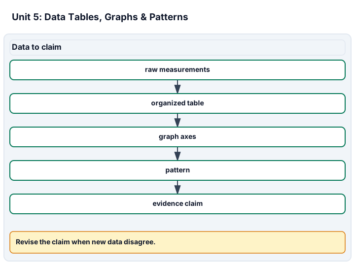
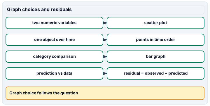
Diagram description
Data to claim moves from raw measurements to table, axes, pattern and claim. Graph choices pairs question types with display choices and defines residuals for model checking.
Data, provenance, and assumptions
| Time (s) | Position (cm) | Use |
|---|---|---|
| 0 | 0 | training |
| 1 | 2 | training |
| 2 | 8 | training |
| 3 | 18 | training |
| 4 | 32 | training |
| 5 | 39 | held-out |
| 6 | 44 | held-out |
| Time (s) | Position (cm) |
|---|---|
| 0 | 0 |
| 1 | 3 |
| 2 | 6 |
| 3 | 9 |
Investigation design: A curve that fits can still fail its next test
Scope and safety: These are supplied-data and paper investigations, not laboratory procedures. An educator must approve any actual practice, materials, location, supervision, accessibility and emergency plan beforehand. Do not grow or open unknown cultures, handle unknown spills, use hazardous apparatus, test hygiene on people, or collect personal health disclosures. Paper work does not certify unobserved practical skill. Public worked answers are nonsecure practice, not private assessor items.
Materials and preparation
- Use the supplied model-track, model-transfer records, assigned source sections, calculator and an accessible graph or diagram. No physical apparatus is required.
Procedure and schedule
- Question: Which graph and model describe the record, and what happens when the model meets observations not used to choose it? Prerequisites: Plot ordered pairs, subtract signed positions and divide by elapsed time for average velocity; core uses squares and honors compares predictive tests.
- Variables: Time is the ordered explanatory coordinate and position the response. Partition into training and held-out observations is fixed before model comparison. Controls: Keep the same coordinate origin, units, plot scales and candidate equations. Never hide held-out points by changing the graph scale or observation labels.
- Sampling and replication: These are multiple times along one synthetic trajectory, not independent repeated trajectories. A follow-up requires new independent trials or checks, not recopying points.
- Analysis: Choose a representation, calculate signed average velocity, compute model predictions and residuals, compare fit in the chosen interval and revise the claim after counterevidence. Review: An educator reviews prerequisites, source interpretation, reasoning and accessibility before assessment. A paper response does not certify unobserved practical technique; approved hands-on work requires a separate record.
Record: Retain source/date, input table, axes and scales, average velocity with units, candidate rules, pre-check predictions, signed residuals, revised claim and fresh transfer prediction labeled as unobserved.
Worked model
Put time on the horizontal axis and position on the vertical axis, using consistent scales and all recorded points. Between t = 2 and 3, average velocity is (18 - 8)/(3 - 2) = 10 cm/s. This endpoint difference does not measure distance traveled between readings. The line 8t has training residuals 0, -6, -8, -6, 0 cm, so the squared-residual sum is 0 + 36 + 64 + 36 + 0 = 136 cm^2. The quadratic 2t^2 fits these training points exactly. At t = 5 and 6 it predicts 50 and 72 cm, but observations are 39 and 44: residuals -11 and -28 cm. Revise the claim to a fit over 0-4 s, not a rule established for all later times.
Numerical calibration
- 10 cm/s; signed average velocity, t = 2 to 3
- 136 cm^2; training data, d = 8t
- 0 cm^2; training data only, d = 2t^2
- -11 cm; observed minus predicted at 5 s
- -28 cm; observed minus predicted at 6 s
- 12 cm at 4 s; conditional fresh linear position-time prediction
Attempt the assigned level
Try the tasks before reading the calibration. These are practice answers, not a secure examination; use a new dataset or changed assumption for the assessed transfer.
Foundation: typically grades 7-8
- Make a table and plot every point with time and position units. Explain why a scatter plot or time-ordered trace fits these data better than a pie chart. Calculate signed position change divided by elapsed time, the average velocity between t = 2 and 3. Distinguish that quantity from position and from an average speed requiring the path traveled.
Check after your attempt
- Time and position are paired numerical variables, not parts of a whole. Label both axes, use uniform intervals and distinguish training from held-out points. The average velocity is +10 cm/s; 18 cm is a position at 3 s, not a velocity. The intervening path and possible reversals are unobserved, so average speed cannot be determined from these endpoints alone. A connecting line is a proposed interpolation, not a measured path.
Core
- Calculate predictions and residuals for both candidate models on 0-4 s. Compare squared-residual sums, then predict positions at 5 and 6 before using their supplied observations. Write a revised conclusion after the check.
Check after your attempt
- The line gives squared-residual sum 136 cm^2; the quadratic gives zero on training points. Yet quadratic predictions 50 and 72 cm overshoot the held-out observations by 11 and 28 cm. Report that the quadratic describes the supplied early interval but fails this later check. Do not erase new points to keep the first claim intact.
Extension: choose by prerequisites, not age alone
- A learner proposes a high-degree polynomial through all seven points and calls it the physical law. Explain why this does not repair the test. Design a fresh observation that distinguishes lower interval-average velocities from a sensor problem and state what remains uncertain.
Check after your attempt
- Choosing a more flexible curve after seeing every answer can absorb deviations without explaining them or predicting a new case. Reserve new times or independent trials, prestate predictions and use an independently checked measurement method under educator approval. A second instrument that disagrees would challenge the original readings; consistent decreases in interval-average velocity across instruments would challenge the early motion model. Neither result alone names the physical mechanism or establishes the unobserved path.
History, reading, and writing connection
Use the historical admissions and deaths in the assigned Significance Table 1 to calculate and graph May and June 1847 mortality rates, retaining dates and denominators. May includes time before and after the mid-May intervention. Compare the full series in Figure 1 and residual counterevidence in Figure 2 with the synthetic motion model's held-out failure. Write a cited interpretation with a limitation: the decline supports preventive action, but a graph alone does not establish causation or rule out trend and seasonality. Historical numerical records and the synthetic motion exercise are distinct evidence.
Write in your own words or use an approved accessible equivalent. Cite a specific assigned section or figure, identify its evidence, and state one limitation or counterargument. Use the AI practice contract only for permitted coaching, never to invent observations or write the assessed response.
Transfer to a new case
Use model-transfer for a new object. Compare a linear position-time model with d = 2t^2, predict at 4 s using the supported simple rule, and state whether the recorded interval-average velocities establish the intervening path or make the prediction an observed point.
Calibration: The recorded positions increase by 3 cm per one-second interval, giving average velocities of +3 cm/s and fitting d = 3t at the sample times. The quadratic predicts 2, 8 and 18 cm at 1, 2 and 3 s rather than the observed 3, 6 and 9. The linear prediction at 4 s is 12 cm, conditional on that model continuing; it is not a measurement. Equal interval-average velocities do not establish the intervening path or average speed.
Evidence to retain
Retain the labeled position-time graph, signed average velocity calculation, prediction/residual table, squared-residual calculations and before/after claim with a proposed discriminating follow-up. Distinguish average velocity from average speed, which requires distance traveled. These address all five data/graph criteria; a supplied trajectory is not an observed apparatus trial. Keep the source-linked written comparison and later transfer as separately identifiable evidence.
Record units, calculations, source/date, uncertainty, and what is measured versus inferred. A simulation or supplied dataset must stay labeled as such. These are supplied-data and paper investigations, not laboratory procedures. An educator must approve any actual practice, materials, location, supervision, accessibility and emergency plan beforehand. Do not grow or open unknown cultures, handle unknown spills, use hazardous apparatus, test hygiene on people, or collect personal health disclosures. Paper work does not certify unobserved practical skill. Public worked answers are nonsecure practice, not private assessor items.
Return to all eight learning pathways. Print this unit page for the student lessons; the linked five-page packet remains the separate assessment companion.
Match evidence to the actual criterion
Integration is reported separately and cannot lower the science grade or block a science demonstration pass. Science and practical criteria determine that pass.
The learner constructs a labeled graph, justifies its type, checks predictions and responds to counterevidence. The supplied-record task can support graphing and interpretation criteria without claiming a performed motion experiment. Use a new dataset or changed assumption for the educator's assessment.
- Science 1: Organizing data in tables. Retain an ordered table with time, position, units and training/held-out labels.
- Science 2: Choosing the right graph. Justify scatter or time-series representation without inventing a parts-of-whole relationship.
- Science 3: Building a graph correctly. Plot all points, units and uniform scales, distinguishing observations from predictions.
- Science 4: Reading patterns & trends. Interpret signed interval slopes as average velocities and examine residual patterns without inferring the unobserved path.
- Science 5: Drawing a justified conclusion. Revise the time range of the claim when held-out points contradict the chosen model.
Source, data, task and review inventory. Retain the selected level, first attempt, source/date, assumptions, correction and a fresh transfer. Do not reuse public answers as secure assessor items.
Unit mastery rubric
| Criterion | Developing | Proficient | Mastery |
|---|---|---|---|
| Organizing data in tables | Jots numbers loosely with no columns, headers, or units — you can’t tell what was measured. | Makes a table but leaves off units, mislabels a column, or lists the rows out of order. | Orders records with identifiers, headers and units; distinguishes repeat trials, times on one trajectory and predicted values. |
| Choosing the right graph | Picks a graph type at random, or graphs data that should have stayed in a table. | Chooses a graph but the type doesn’t fit — a bar chart where a line would show the trend. | Chooses scatter, time-series or categorical comparisons to fit the variables; explains any interpolation or parts-of-whole claim. |
| Building a graph correctly | Leaves the axes unlabeled, lets the scale jump around, or drops points in the wrong place. | Labels the axes but uses an uneven scale, forgets the title, or plots a point or two carelessly. | Draws it right — both axes labeled with units, an even scale, a title, and every point plotted accurately. |
| Reading patterns & trends | Reads single points but misses the overall shape, or invents a pattern that isn’t there. | Notices the line rises or falls but can’t say what that means for the two things measured. | Interprets signed rates (average velocity for position-time intervals) and model residuals with units; distinguishes a pattern from its possible mechanism. |
| Drawing a justified conclusion | States a conclusion the data don’t support, or claims the data prove more than they do. | Draws a reasonable conclusion but doesn’t tie it to the graph or admit its limits. | States what observations support, tests a fresh prediction and revises the claim when counterevidence exposes a limit. |
| Integration (cross-domain) | Makes no supported connection between the source and the science. | Uses the source but needs help connecting evidence, writing, or limitations to the science. | Independently connects History, Reading, and Writing using a cited source, appropriate evidence, a limitation, and a scientific explanation. |
Integration is reported separately and cannot lower the science grade or block a science demonstration pass. Science and practical criteria determine that pass. Use the integration guide's evidence checklist for the separately reported criterion.
The quadratic fits the five training points, but at 5 seconds it predicts 50 cm and the new value is 39 cm. I keep the -11 cm residual and narrow the claim to the early interval. A perfect fit is not a universal mechanism.
I removed the later points so the curve stayed perfect, then drew a smooth line and called it proof.
The learner constructs a labeled graph, justifies its type, checks predictions and responds to counterevidence. The supplied-record task can support graphing and interpretation criteria without claiming a performed motion experiment. Use a new dataset or changed assumption for the educator's assessment.
A 5-page clipboard packet — unit overview, key terms, the mastery rubric, anchor examples, and a score sheet you can print and grade against.